 Anne DeWitte1
Abstract
Appliance overlays using tactile icons promote self-sufficiency in the home for people who are visually impaired. The tactile icons identify the location and function of buttons on home appliances that have touch surface controls. Based on a universal design, these tactile icons are a world-wide solution for tactile labeling and identification.
Introduction
Many new ovens, dishwashers and other home appliances have flat, touch sensitive control panels instead of tactile buttons and knobs. Though these smooth interfaces are sleek and easy to clean, it is difficult for people with visual impairments to identify the appliance controls. Our goal is to develop and evaluate low-cost home appliance tactile overlays for people who are visually impaired.
Background
Tactile communication is dominated by Braille code but with the growth of dynamic tactile interfaces for sighted and non-sighted people, perhaps other tactile communication codes are needed. Braille is a code composed of raised dots in a 3x2 grid called a cell. In Grade 1 Braille the arrangement of dots in a cell represents a character or punctuation symbol. One or more Braille cells creates a word whose meaning is specific to a language – just like Romanized letters used by multiple languages. Braille is a universally used structure, not a universal language. With this understanding, we wondered if there were tactile codes with meanings that transcend language. Are there universally accepted tactile icons similar to some visual icons? Our investigation found stickers, tape and puff paint materials used to create custom tactile labels and identifiers but no common tactile designs. Our project to develop and test tactile overlays for home appliances was inspired by the need for a structured, universal tactile communication code.
About the experiment
Testing of different overlay types and tactile icon designs by visually impaired test subjects was performed in two parts. Part 1 was a scored test that compares an existing tactile labeling method with labeling ideas that represent universal designs. Also Part 1 included evaluation of simple tactile icons. Testing was supported by the Association for the Blind and Visually Impaired (ABVI) in Rochester, NY. Under the direction of Joe Kells, Director of Business Development, the Rochester ABVI organization supports studies that are focused on improving the lives of the blind and visually impaired. ABVI provided test space and was a conduit to a visually impaired population which resulted in 12 visually impaired test subjects for the study.
Part 2 of the experiment was performed by graphic design students at the Rochester Institute of Technology (RIT) in fall 2015. Their teacher, Professor Deborah Beardslee from the School of Design learned of the universal tactile code idea at the Effective Access Technology Conference at RIT. Professor Beardslee challenged her Information Design class to design, produce and test appliance overlays using tactile icons. Three visually impaired test subjects from the ABVI experiment served as evaluators for the student-produced overlays.
Test Participants
Twelve visually impaired people were compensated $20 for a 30-40 minute test session.
Age Distribution
| 1 | 2 | 1 | 3 | 5 |
Gender
| 10 | 2 |
Braille Reader
| 6 | 6 |
Methods
Part 1 – Appliance overlay comparison and tactile icon evaluation
The testing for Part 1 was conducted over two days in a conference room at the ABVI in Rochester, NY. Test participants were scheduled each hour with a session lasting from 30-50 minutes. The full protocol of the test is described here. An overview of the test process is listed in Figure 1 below.
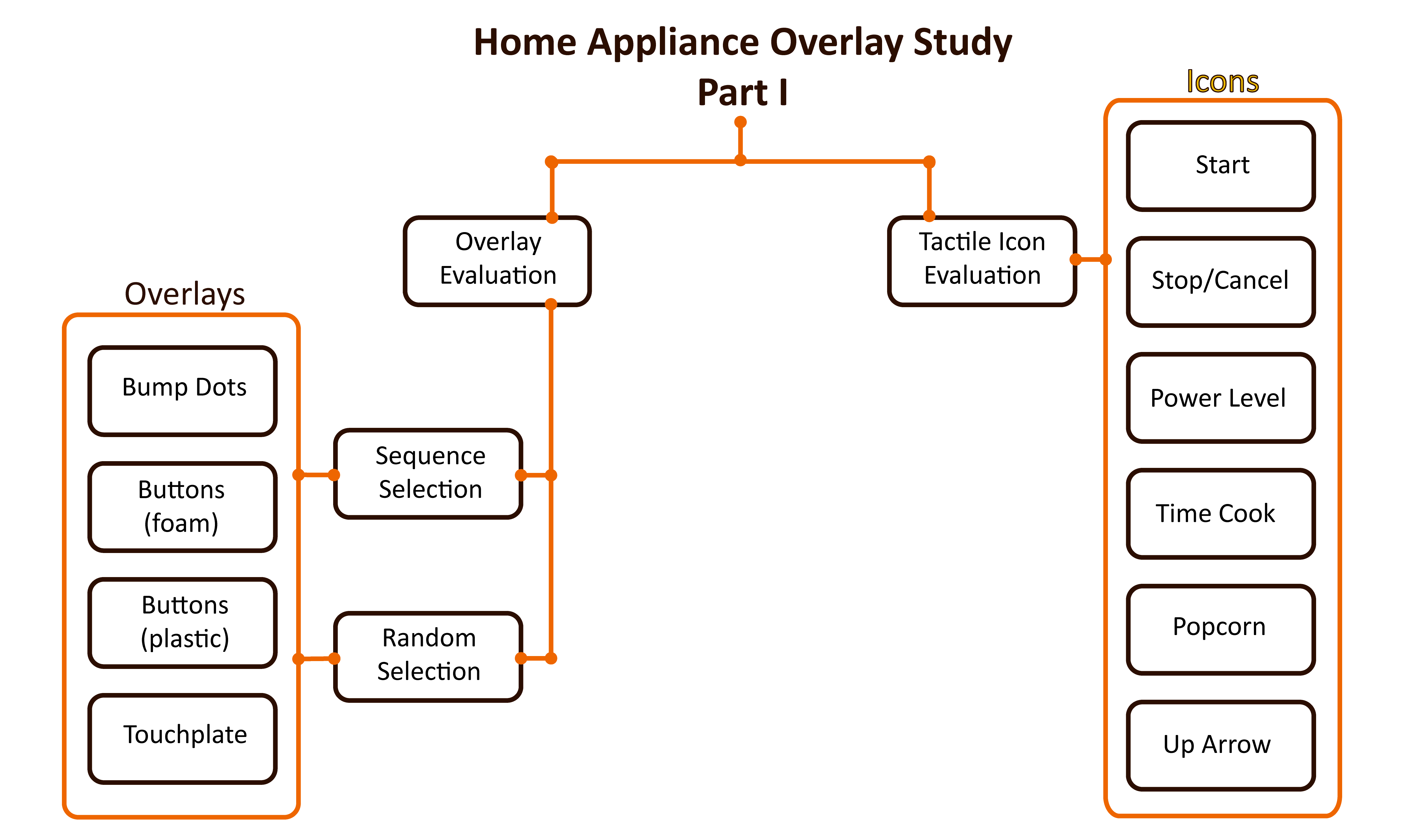
Figure 1: Test and Evaluation Structure of Part 1 - Home Appliance Overlay Experiment
Overlay Evaluation
The overlay evaluation tests used a touchscreen monitor to simulate a simple microwave oven interface. See the test fixture lab note. Four overlays (Figure 2) were created for the microwave interface – Bump Dots, Buttons (foam), Buttons (plastic) and Touchplate. The Bump Dot overlay represented a common labeling method and the other three represented possible universal designs for appliance labeling. See the test overlay lab note to learn why these overlays were selected and how they were created.
Figure 2: Overlays used in Part 1 - Home Appliance Overlay Study
For each overlay, the test participants performed two timed tests, sequence and random selection, and answered usability questions.
Part I - Heat a Beverage (Sequence Selection)
Part I - Find a button (Random Selection)
Tactile Icon Evaluation
The tactile icon evaluations presented six sets of tactile icons (Figure 3). Test subjects were asked about shape preferences, relation of shape to function and general observations and opinions about the icons.
Figure 3: Plates for tactile icon evaluation - tactile icons tested are Start, Stop/Cancel, Time Cook, Power Level, Popcorn, Up Arrow
Thought process behind tactile icon selection -
- Start – Early tape recorders used a right pointing triangle for start and this design continues today on audio equipment and digital tools. The triangle variations we tried (from left to right) – Simple triangle, outline triangle, triangle with raised dots at the three vertices. The far right shape was to provide a non-triangle option. It is a shape that typically represents an on/off feature.
- Stop – Continuing with the tape recorder precedent, the stop button was represented by a square. For this reason we have included two square tactile icons for stop - one an outline and one a filled square. The downside of the square is this shape is often used for generic buttons. The two X shapes are included because X is commonly used for stop and cancel features. Also the X shape is distinctive and easy to recognize.
- Time cook – From left to right. 1) A clock face with raised dots at the 12, center and 3 clock positions. 2) An attempt to represent a stop watch. 3) A clock face where the cutout represents the space between 12:00 and 3:00. 4) Partial moon shape. This shape was presented because the timer on a commonly used book reader for the visually impaired was in the shape of a moon.
- Power level – From left to right. 1) A lightning bolt to represent electrical power. 2) A shape to represent increasing level. 3) Another attempt at a lightning bolt. 3) An easy to recognize tactile shape that could be imprinted to represent power level.
- Popcorn – Rounded protrusions in multiple directions emanating from the center - like a popped kernel. We could only think of two icons!
- Up arrow – An open arrow was chosen to represent direction. These tactile icons vary in width and height to find the dimensions that are preferred.
Part II – Evaluation of student-produced overlays
Nineteen undergraduate students from the Rochester Institute of Technology (RIT) School of Design designed, developed and tested tactile icon overlays for microwave oven and conventional oven control panels.
The students’ objective was to develop easily recognizable tactile icons that work as a system. The students developed icons for the most common functions on a GE microwave oven and all the functions on a Kenmore conventional oven. The materials provided to the students were clear film (backing for the overlay) and EVO foam (for the tactile icons - material that tested well in the ABVI test). Students recorded feedback from the evaluators, identified modifications based on the feedback and produced final reports. See Figure 4 below.
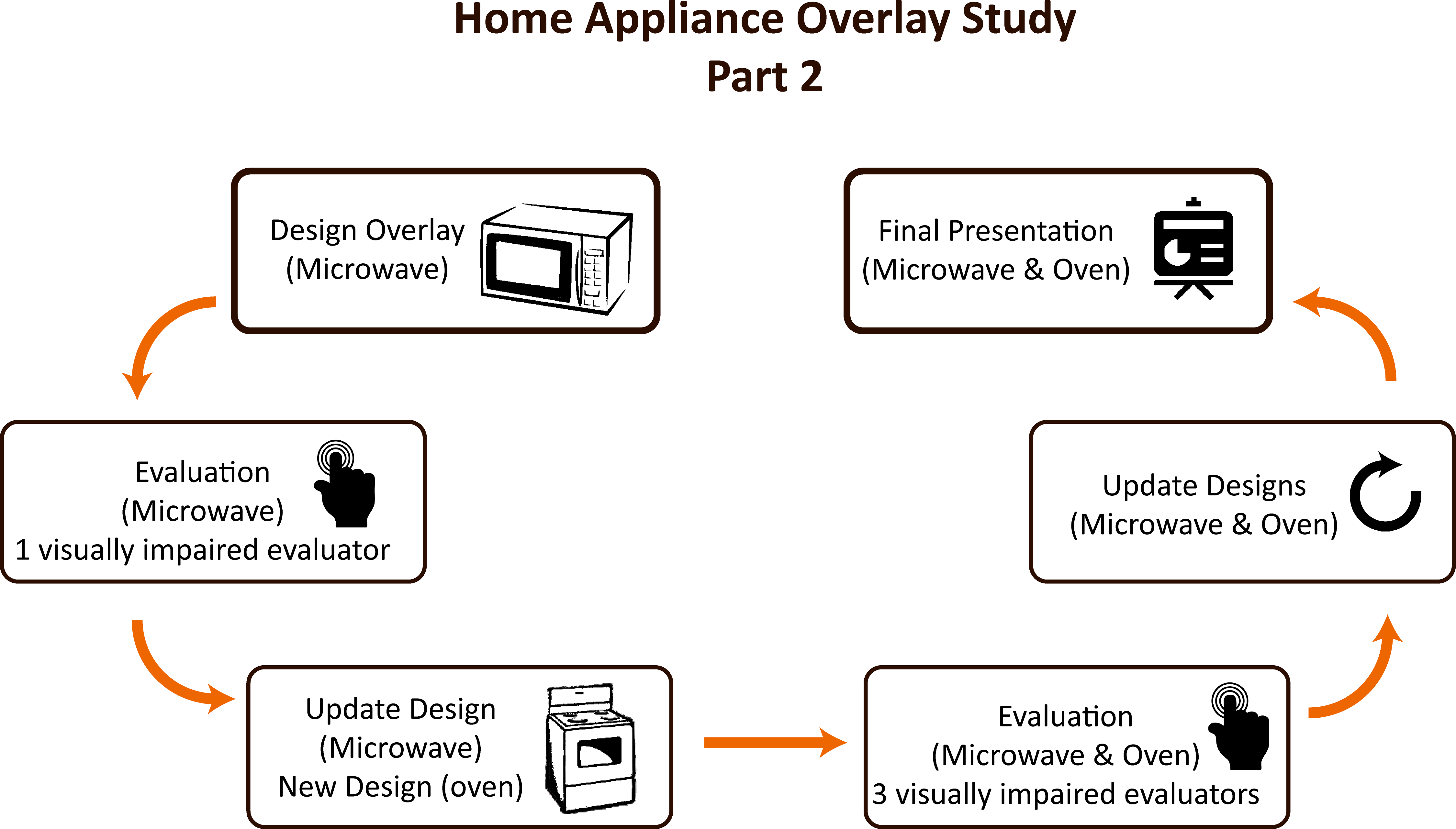
Figure 4: Test and Evaluation Structure of Part II - RIT Tactile Overlay Evaluation
Scaled pictures of control panels from a GE microwave and Kenmore conventional oven provided the layout and spacing.
Figure 5: Control panel models of GE Microwave and Kenmore Oven Appliances for Part II RIT Tactile Overlay Evaluation
Challenges
A qualitative analysis of different overlays requires capturing accurate button press location and the time stamp. We choose to do this with overlays on a touchscreen monitor. The challenge was to create a touch surface that best represents the physical interaction of a button press on an appliance control panel.
Another challenge of conducting the studies is travel logistics. Travel is a difficult for people who are visually impaired - many test subjects had to make special arrangements to reach the test site at a specific time slot. This also highlights the need to compensate test subjects for their time and effort.
Results
The results of the test revealed acceptance of tactile icons as a method for labeling home appliances.
In this section we report the major results of the study - Part I: Overlay evaluations (speed/efficiency, accuracy, usability) and Part II: Tactile Icon Research with RIT School of Design students
Part I: Overlay Evaluations
Speed/Efficiency: The ability to quickly identify a control is an indicator of a useful overlay. The charts below show the time to find a single button (random selection) and the time to complete a series of button selections (sequence selection).
Accuracy: Accuracy is determined by error rate – a higher error rate means lower accuracy. The charts below show the error rate for the random selection and the sequence selection.
Random button selection time. Finding a specific microwave button was 20% faster on average using the foam/felt overlay compared to the bump dot overlay.
Figure 6: The time to find and select a single button using the foam/felt overlay was significantly faster (M = 2.62, SD = 1.1) than the bump dot overlay (M = 3.28, SD = 2.08), p < .05.
Less than one in twenty attempts to find a specific microwave button resulted in an error when using the raised tactile icon overlays (foam/felt, shaped bump dot). The error rate was more than double when using the touchplate or bump dot overlays.
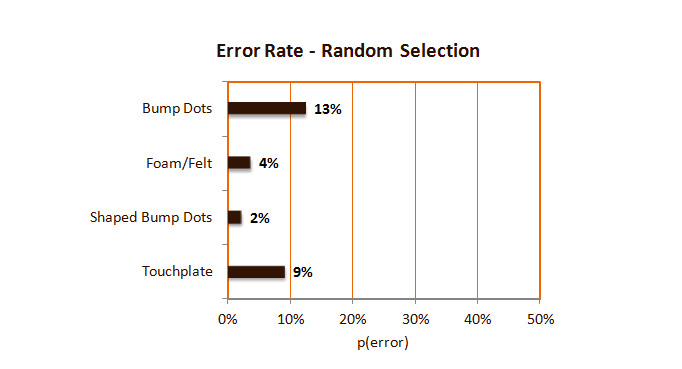
Figure 7: Random Button Selection Error Rate
Sequence selection. Test participants were asked to select a series of buttons that represented heating a bowl of soup in the microwave. The test participants were able to perform the button sequence 34% faster on average with the foam/felt overlay compared to the bump dot overlay.
Figure 8: The time to select a series of buttons using the foam/felt overlay was significantly faster (M = 21.2, SD = 5.78) than the bump dot overlay (M = 32.28, SD = 16.58), p = .05.
The error rate of the sequence of button selections showed surprising results. Four out of twelve attempts to successfully complete the button sequence were incomplete when using the shaped bump dot overlay. On the other hand all test participants successfully selected the button sequence with the foam/felt overlay.
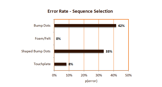
Figure 9: Sequence Selection Error Rate
Diving deeper
We collected age, gender, braille ability and index finger size of each participant. There was a wide range of test participant ages with the largest group over sixty years old. We chose not to analyze age for this study because of the weighted distribution towards people over sixty years old. Since there were only two males in the participant pool, we did not analyze gender differences. Braille literacy and finger size, however, did show some interesting results.
Braille Reader. Below is a chart showing average button selection time categorized by ability to read braille. Comparing the combined time for all overlays, those who read braille are significantly faster overall. Braille users were 16% faster on average.
Figure 10: Braille Literacy Influence. The overall average time for braille readers is 2.95 seconds and for non-braille readers is 3.42 seconds.
Finger Size. Comparing the combined time for all overlays, those with smaller fingers are significantly faster overall. Smaller fingers were able to make selections on average 24% faster.
Figure 11: Finger Size Influence. The average button selection time for smaller fingers is 2.82 seconds and for larger fingers is 3.57 seconds.
Usability. We asked participants three questions about usability for each overlay using a Likert scale.
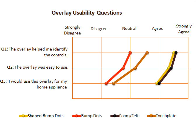
Figure 12: Tactile Overlay Usability Results - The usability scores for the raised shape overlays were higher than the bump dot and touchplate overlays.
Part II: Tactile Icon Research with RIT School of Design Students
Professor Deborah Beardslee's Information Design Class at the Rochester Institute of Technology (RIT) was invaluable in advancing our knowledge of tactile icon design. See the lab note from our first evaluation session. Below are the major observations -
Tactile icons that tested well.
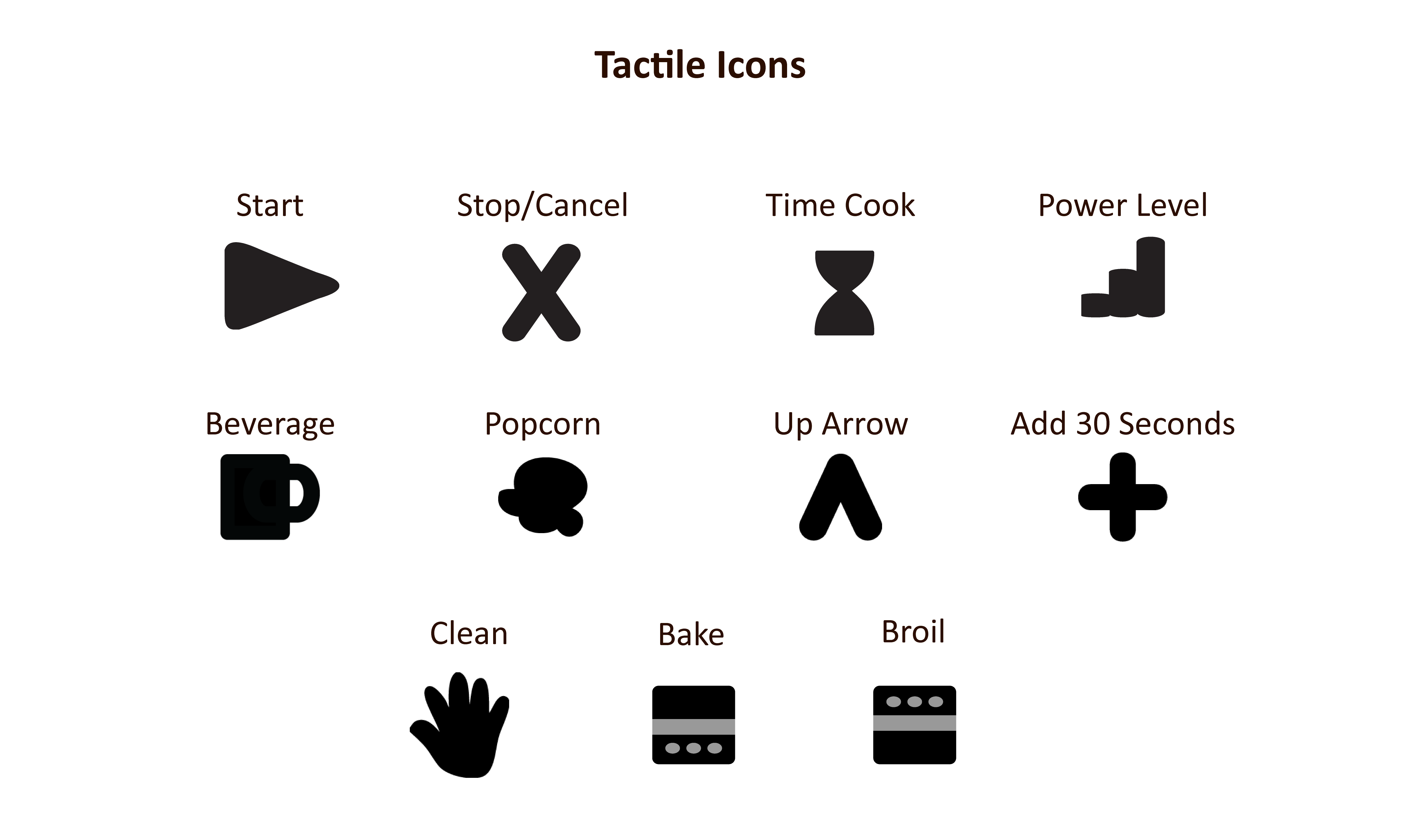
Figure 13: Successful Tactile Icons
Button Representation: Some control panels, especially microwaves, have a confusingly large set of features. For example one Electrolux microwave includes fast recipe controls for poultry, fish, dessert, snacks and casseroles. Who really uses these features? Should there be a unique tactile icon for every single control? Our first thought was to use a generic shape for features we thought were superfluous. As the study continued and we had further discussions and interactions with the visually impaired evaluators, we now believe there should be tactile icons for every control. It is too difficult to determine an unnecessary feature on an appliance - the manufacturer added the button for a reason. However if a generic button is needed, a wide, rectangular shape works well.
Details matter: Small design modifications can make a difference in the tactile recognition of an object. For example, of the multiple hourglass designs tested for the time cook feature, the tactile icon with a slightly curvier shape tested better than others that used simple straight lines.
Shape depth: Multiple height tactile icons can help differentiate buttons. For example different height icons can separate keypad buttons from function buttons on a microwave control panel.
Be aware of braille: Avoid using a design that could be confused with braille. One group tested a tactile icon that had two, fairly large, adjacent dots. Visually impaired testers rejected the design because it may be confused with braille code. On the other hand another design used three dots in a row and that was accepted.
Easy to clean: Many complex tactile icon ideas were easily recognized but not accepted because the evaluators were concerned about cleaning. The design should not collect food particles or dirt, meaning designs with nooks and crannies should be minimized.
The data collected is available for download here.
Conclusion
Bottom line - if you are visually impaired and need to heat a bowl of soup in a microwave, use a microwave with a raised tactile icon overlay.
The primary and practical goal of the experiment was to develop and test home appliance tactile overlays for people who are visually impaired. This activity gave us an opportunity to discover the overlay features that are important to the visually impaired population. The results demonstrated that overlays with raised tactile icons – the foam/felt and shaped bump dot overlays – performed better than the baseline bump dot overlay. Beyond understanding dimensions and shapes we also learned practical requirements such as overlays must be easy to clean, use low glare material, avoid sharp angles and, surprisingly, it must be visually unobtrusive. In conclusion, the tactile icon overlays can be an effective home appliance labeling system. With this customer focused knowledge we plan to produce tactile overlays and make them available for people who are visually impaired. See the Overlays are now available for purchase lab note for more information.
The strategic goal of the experiment was to evaluate tactile icons as a possible universal design for tactile communication. The quantitative and qualitative results from the experiment provided evidence that tactile icons are a viable option for tactile labeling and identification. Since the tactile icon idea has never been tested in such a broad and practical domain, it was important to know that we could produce a variety of meaningful and distinctive shapes. We look forward to more opportunities to promote the development and usage of these tactile icons.
Acknowledgements
- Thank you to Joe Kells, Business Director at ABVI, Rochester, NY for supporting this activity.
- Thank you to Professor Deborah Beardslee at the Rochester Institute of Technology (RIT) School of Design for using the tactile icons as a class project.
- Thank you to Cindy Wu and Denny Luan at Experiment for guiding me through the crowdfunding activity.
- Thank you to Carol Thomas for the excellent testing support, even when a tree fell on her house the second day of testing.
- Thank you to my Experiment backers!
- Thank you to Kay Rhineback one of the test participants for encouraging me to continue development of the overlays after the experiment. Also Thank you to Lisa Hoffman and Kirstyn Smith for their post experiment support.
- Thank you to my husband Dan Shelley who made this all possible.